ToolBar
Screenshots and diagrams on this page illustrate the historical desktop tools or conversion workflow; installed versions may look different.
The default toolbar control (accessory in the form) is enhanced to support Windows Visual Styles and to look like the ToolStrip controls in WinForms without having to rewrite the code that relies on the ported controls.
It is enough to set the two new properties of the ToolBar control to automatically upgrade the look & feel of the toolbar and all the buttons that are contained.
The typical look of the toolbar using the default Visual Style mode is shown below:
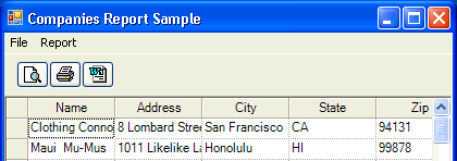
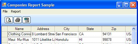
Setting the UseVisualStyleBackColor property of the ToolBar control to true, enables the enhanced background painting and the toolbar looks like the image below (depending on the color scheme):
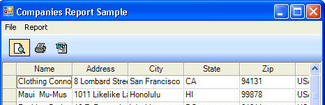
To change the appearance of all the buttons on the toolbar to look like a ToolStrip control, set the Appearance property to Flat. When the Appearance = Flat and UseVisualStyleBackColor = True, the toolbar control looks like this:
XSalToolBars
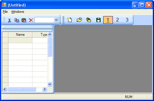
The same effect is supported in XSalToolBars by setting the static properties in XSalToolbar as:
XSalToolbar.UseVisualStyleBackColor = true;
XSalToolbar.Appearance = ToolBarAppearance.Flat;
Integration Checks
These settings concern desktop toolbar rendering. Verify keyboard focus, access keys, disabled buttons, tooltips, and high-DPI layout after applying them. Preserve the existing command handlers while changing appearance.